Project Overview
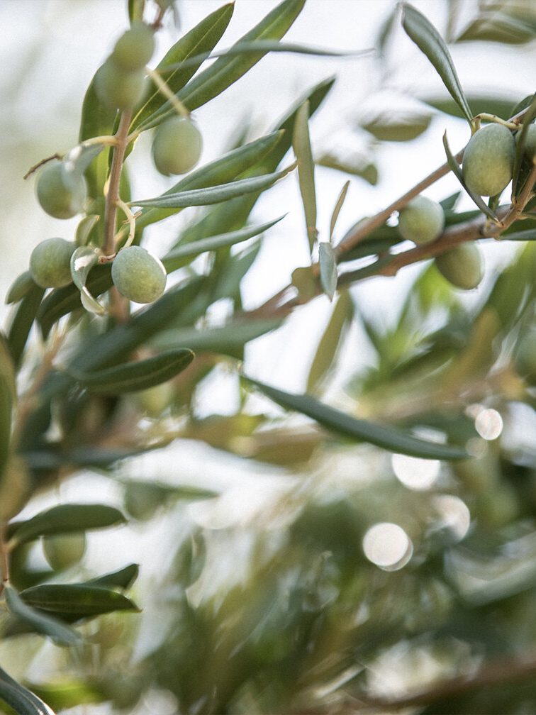
JDM Estate sought a brand identity that reflected the heritage, quality, and craftsmanship of their wines and olive oils. The goal was to blend old-world charm with a modern elegance.
MY ROLE creative direction, packaging, branding, logo, assets, brand guide, brand strategy, iconography
Strategy & Approach
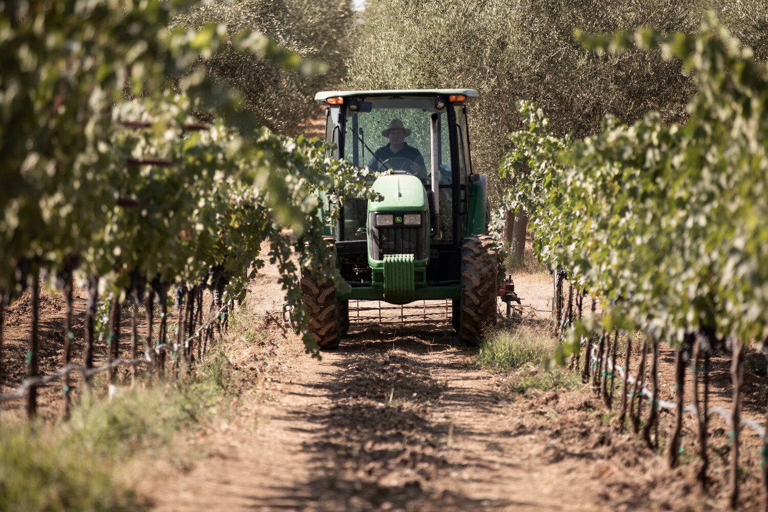
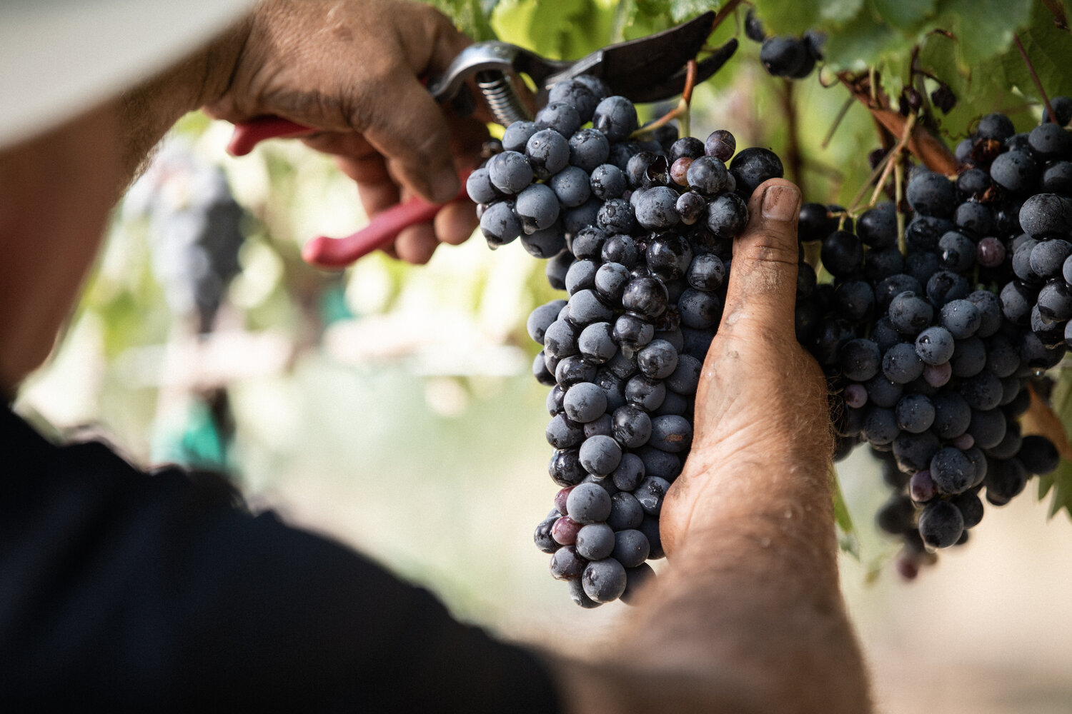
The brand strategy focused on creating a timeless aesthetic that would resonate with both seasoned wine connoisseurs and new customers. By elevating traditional design elements and combining them with clean, modern structure, the identity could stand confidently in premium retail and digital environments. Every design decision—from the serif type to the rich color palette—was chosen to reflect authenticity, warmth, and legacy without feeling overly ornate or inaccessible.
Creative Direction
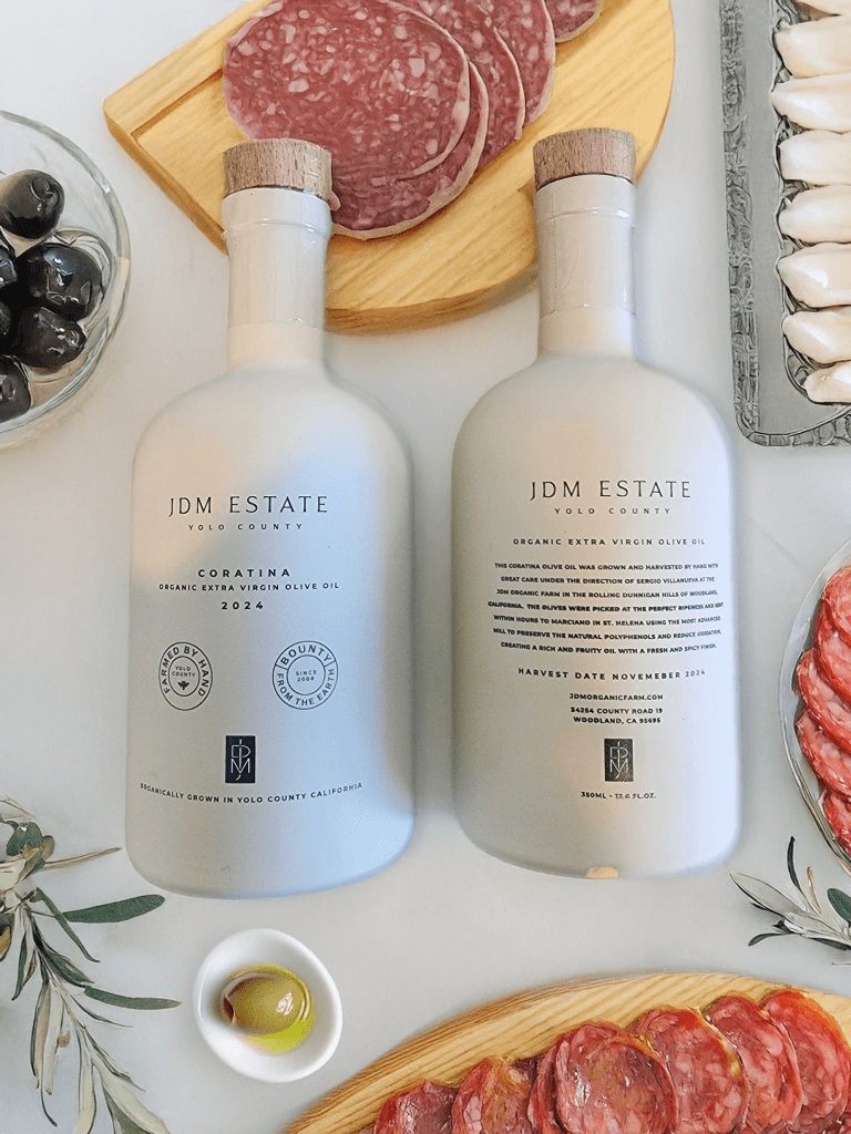
Creative direction balanced elegance and restraint. Premium label designs used minimalist layouts, subtle iconography, and rich materials to reflect the brand’s roots and refined offerings. Color stories were developed to visually separate wine and olive oil lines while maintaining harmony across the product family. A mood-forward video piece captured the ambiance of the estate, and the website was designed to serve as a digital tasting room—clean, thoughtful, and easy to navigate.
Solutions
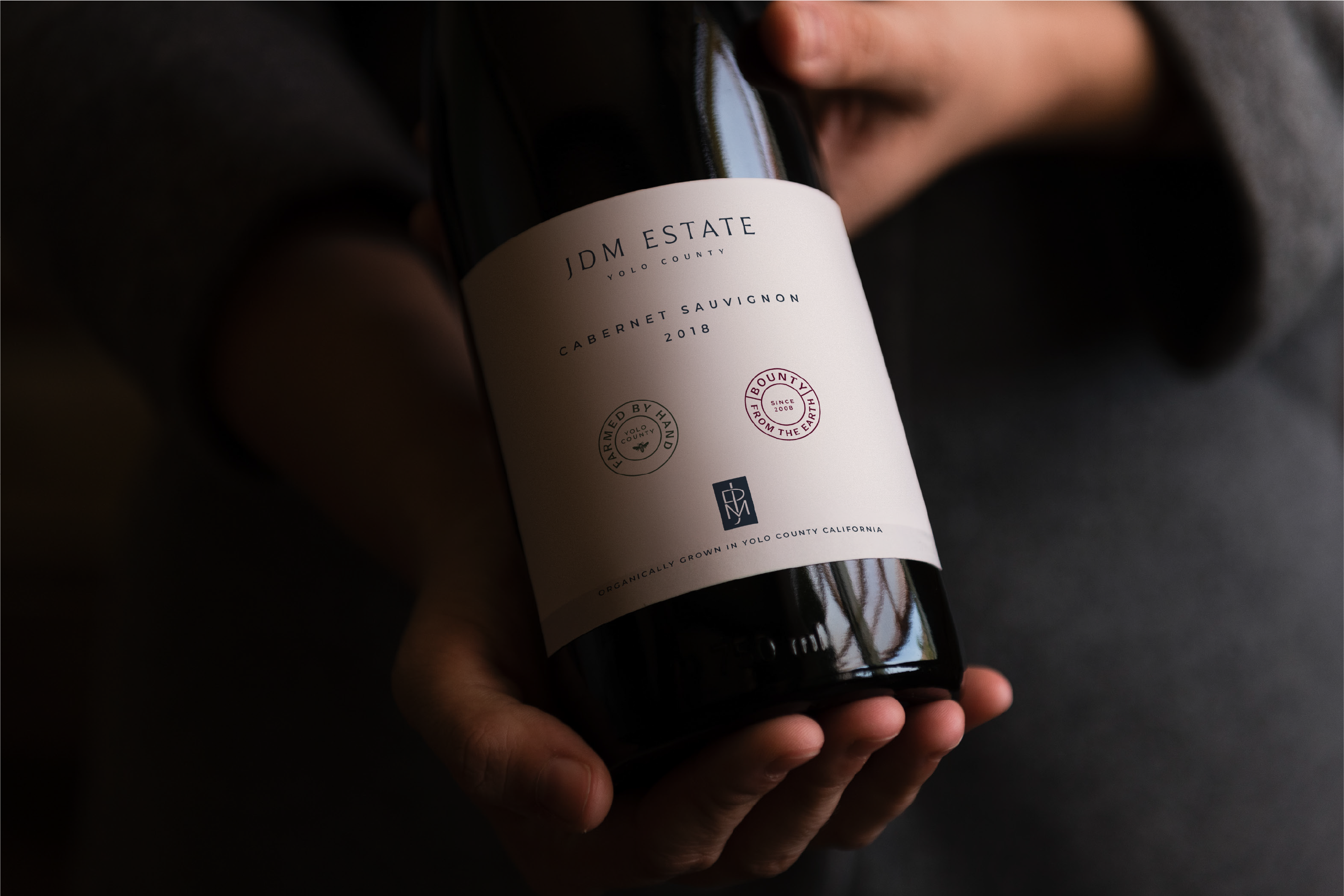
Branding & Labels
The core solution was a flexible label system that could scale with future SKUs. Primary products received a clean serif wordmark with generous spacing and tactile finishes, while premium lines were designed with foil accents and alternate layouts.
Website Creative Direction
The website centered around storytelling, rich product photography, and intuitive navigation. Marketing materials included tasting notes, product inserts, and digital ads, all rooted in the same brand voice and visual language
JDM Estate’s brand now mirrors the craftsmanship behind their offerings. The identity is refined, grounded in tradition, and thoughtfully positioned for growth across product lines and digital spaces.
